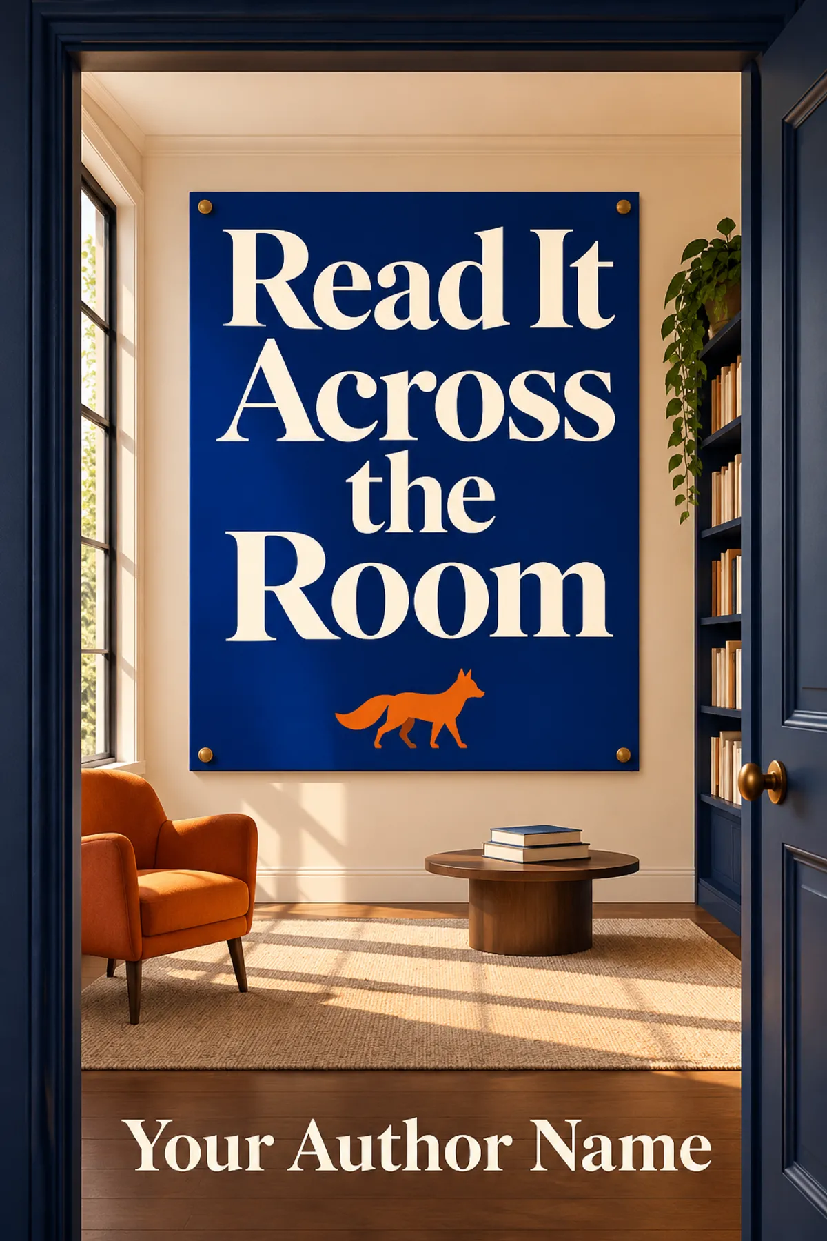
Read It Across the Room
Test what a reader can see, read and expect before committing to a cover.
ImagineYourBook writes a fresh draft from this idea.
Introduction
The fox looked terrific. From across the room the title said nothing at all.
Maya had made a cover for a guide to photographing urban wildlife. At her desk she could see individual hairs around the fox's ear. The title sat on a dark band in small copper letters. She asked Tobias to look at the covers from the door. He saw the fox immediately and thought the book might be a novel about an animal.
Maya took the print off the wall. At arm's length, she could read the title. On a small shop listing, the band might disappear into the rest of the image. She wanted the fox to make someone look and the words to tell them what they would find.
Before choosing between cover concepts, decide what each part needs to do. Put them at the size people will actually see. A small image can tell you whether the title has enough room and contrast, whether the credit can be read and whether there is a clear focal point. A full print can reveal awkward margins, details that feel crowded or colors that behave differently on paper. These are separate checks.
Show two covers to someone who has not heard the whole project. Ask what words they can read and what sort of book they expect. Give them a few seconds, then let them look longer. The first answer can tell you what the cover communicates immediately. The later answer can show what survives closer reading. A few readers can help you see a design problem. They cannot tell you how many copies the book will sell.
Maya kept the fox and made it smaller. She gave the title a pale field and set the key words on two lines. Tobias went back to the door. This time he said it looked like a practical photography book. Then he asked how she had taken the picture.
"I drew it," Maya said. "The real fox was much less cooperative."
Chapter plan
Develop this idea
Work with invented examples and show how the same cover changes across contexts. Ask what people can read and what kind of book they expect. Keep tiny samples separate from claims about sales. Discuss asset rights, contrast and print proofing only where they affect the decisions. Give each reader a short comparison method that can expose a specific problem and suggest what to test next.
- Open with a handsome image and an unreadable title.
- Name the reader and expected genre before comparing concepts.
- Shrink each cover to a realistic thumbnail.
- Compare what people can read without coaching.
- Check whether the focal image sets the right expectation.
- Test contrast, spacing and author-credit placement.
- Compare two meaningful changes at a time.
- Use original or properly licensed assets.
- Review a physical proof when print matters.
- Make a final choice with a clear reason.
Series possibilities
- A guide to using book cover research without reproducing another edition's design.